

Did the Strategic Oil Reserve Lower Gas Prices?
Did the Strategic Oil Reserve Lower Gas Prices?
Did the strategic oil reserve lower gas prices?

The Strategic Oil Reserve (SOR) is the federal government's massive supply of oil reserved for managing the country's oil supply during emergencies. The e-word is key here because it means the SOR isn’t intended to be used willy-nilly. It is intended to be used for situations such as the 1973 - 1974 oil embargo from OPEC-- which led to the creation of the SOR. Because of the decline in the SOR before gas prices peaked and continued decline since it has been suggested that the Biden administration has used the SOR to lower gas prices in preparation for the 2022 midterms.
But I don’t buy that theory as an explanation for the decline in gas prices since this summer. First, the SOR has been declining or plateauing pretty consistently since the early-2010s. Since then, gas prices have gone up or down with no obvious relationship. Even since August 2021-- when the SOR began to be used to a higher degree--, it wasn’t until almost a year later that gas prices finally peaked. If there is a relationship, it must be pretty weak.
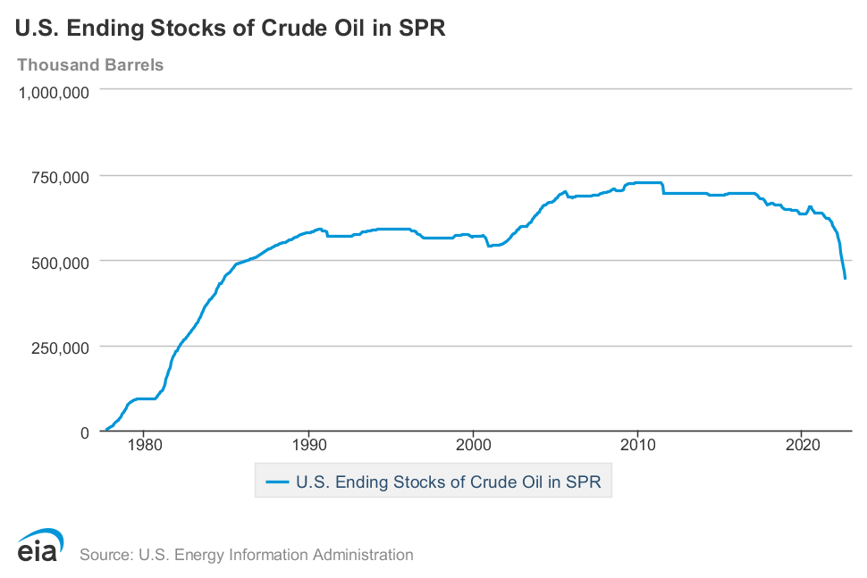
Second, even at its peak, the SOR was less than 750,000,000 barrels and the US uses almost 20,000,000 barrels a day. The SOR is swamped by actual US oil consumption. And remember, oil prices-- of which gas is a function-- are global markets. I’m not sure what evidence there is that increasing the global oil supply by less than a million barrels a day has a meaningful impact on gas prices.
Yet an analysis from the Treasury Department found that the SOR is responsible for a $0.13 to $0.31 decrease in gas prices. This analysis raised a few questions in my head. First, the press release does not link to a document that provides a detailed outline of how exactly the analysis was done, what timeframe was used, or the relevant significance level. Given that this press release was published on July 26th (gas prices had already been declining for 6 weeks), my hunch is that whoever did this analysis did something along the lines of regressing the decline in the SOR against the decline in gas prices.
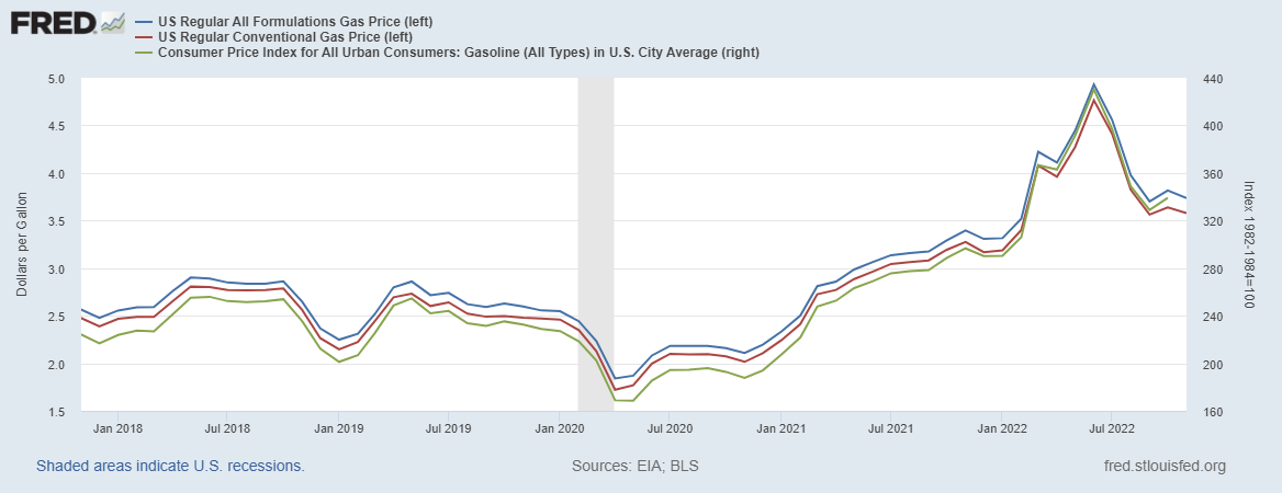
Since I find neither of the above arguments convincing, I wanted to dig into the question myself. For this analysis, I’ll use three measures for gas prices from the St. Louis Federal Reserve and data from the Energy Information Agency for SOR levels. The time range for all four-time series is 9/1/1990 through 8/1/2022 with monthly observations. Any transformations will be done by myself in Python. I’m also keeping this to high-level visual analysis since I didn’t find anything interesting.
To start, I simply plotted the level of the SOR against gas prices. While these plots suggest that gas prices increase as the SOR increases in size, this is likely due to both generally increasing over time.


To show this effect, I broke the data into decades. Because the three series are so similar, I only used one.


But levels likely aren’t the best way to analyze this data. After all, the likely mechanism here is that gas prices are responding to the change in the SOR, not the level of the SOR itself. This time I plotted the same variables but as percent changes. Again we have very similar graphs between all three, but with an even less clear relationship.
But I’ll be charitable one more time. What if there is a lag between a change in the SOR and a change in gas prices? If we add a one-month lag we will see how a change in the SOR will impact gas prices next month. And again, no clear relationship
.


While this analysis can’t come close to ruling out a more nuanced relationship in a noisy world, the proponents of the SOR theory need to be able to put forth some evidence of that nuanced relationship.