


European Journal of Epidemiology Publishes Hot Garbage
Even prestigious journals can publish deeply flawed papers.

Prior to today, I would’ve imagined the European Journal of Epidemiology would have a rigorous standard for what it publishes. Turns out it was wrong. Papers that wouldn’t cut it in an introductory econometrics course can apparently be published in the prestigious journal. About a week ago the journal published “Increases in COVID-19 are unrelated to levels of vaccination across 68 countries and 2947 counties in the United States” (Subramanian 2021, from here on).
The paper presents two main arguments. The first is a scatter plot of the percent fully vaccinated against COVID-19 cases per one million in 68 countries. That’s it. It’s a simple bivariate analysis. To be clear, bivariate analysis isn’t inherently wrong, but it depends on the context in which it is used. A published analysis in a prestigious journal needs to do more than simply plot two variables. This excess simplicity ignores the massive variation between countries in testing, quality of vaccines, nonpharmaceutical interventions, and reporting. The second argument presents data for US counties grouped by vaccination rate. This blog post will focus on the first argument and only touch on the second argument.
Differences in vaccine quality
It has been well established that multiple high-quality vaccines have been developed to protect against COVID-19, but not all vaccines distributed globally are high quality. Sinopharm and Sinovac (both developed and distributed by China), have a questionable record against COVID-19.
Differences in reporting quality
Another concern I have with Subramanian 2021 is the quality of reporting between countries. Does the data coming out of Brazil, India, Libya, and Ukraine match the data quality coming out of Canada, Germany, and the United Kingdom? In other words, is the reported number of COVID-19 cases as a proportion of the true number of COIVD-19 cases equal across the two groups? We already know deaths are underreported around the globe.
Differences in testing quantity
Subramanian 2021 also ignores testing differences across countries. For example, Israel is averaging 11 COVID-19 tests per 1,000 people while Denmark is averaging about 6 and the US is averaging about 4. If Israel is testing about 3 times as much as the United States then they will discover more cases per capita even if they have outbreaks of equal size.
Differences in nonpharmaceutical interventions
Lastly, Subramanian 2021 does not address the impact nonpharmaceutical interventions have on COVID-19 cases. Denmark has lifted the last of its COVID-19 restrictions while much of the US has at least most mask restrictions in place. That might not seem like a huge difference but it needs to be accounted for.
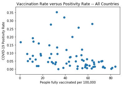
To address the above concerns, I’m taking the same analysis but limiting it to European and North American countries. I’m doing this because they all use the same set of vaccines and have all had generally similar restrictions. Additionally, I will also use the positivity rate to consider testing differences. A clear negative relationship can be seen.
A quick note on the US argument
Curiously, when addressing US data Subramanian 2021 only presents a box and whisker plot and box chart, but no scatter plot. While I don’t have proof, I think it has to do with the fact the median estimate for cases per 100,000 clearly decreases as the vaccination rate increases. A scatter plot simply wouldn’t create the desired visual.

Who is driving rising cases?
Lastly, both arguments in Subramanian 2021 share one common flaw. Who is driving the rise in cases? If the rise in COVID-19 cases in a highly vaccinated society is being driven by the unvaccinated, then that is not evidence that vaccinations are not effective at reducing transmission.

Update 10/18/2021: An earlier draft of this article said “the median estimate for cases per 100,000 clearly decreases as addressing rate increases”. That error has been fixed.
The data in this paper may be systematically messed up. It mostly depends on categorizing counties and countries in various ways versus vaccination rate. Yet the examples the paper gives explicitly as above 90% vaccinated seem very wrong: Chattahoochee (GA), actual 15.2%, McKinley Co (NM), actual 60%; Arecibo (PR) actual 20%. (My data from data.news-leader.com/covid-19-vaccine-tracker). So it might be worth checking if the paper’s wrong attribution of vaccination rate to counties applies across the board. At the very least it suggests very poor quality control or review, since it is surely surprising that these counties would have such high vaccination rates. (Along with Figure 2’s obvious decrease in cases with higher-vaccination rates, strangely at odds with the written narrative.)
"the median estimate for cases per 100,000 clearly decreases as addressing rate increases" -- did you mean vaccination rate?